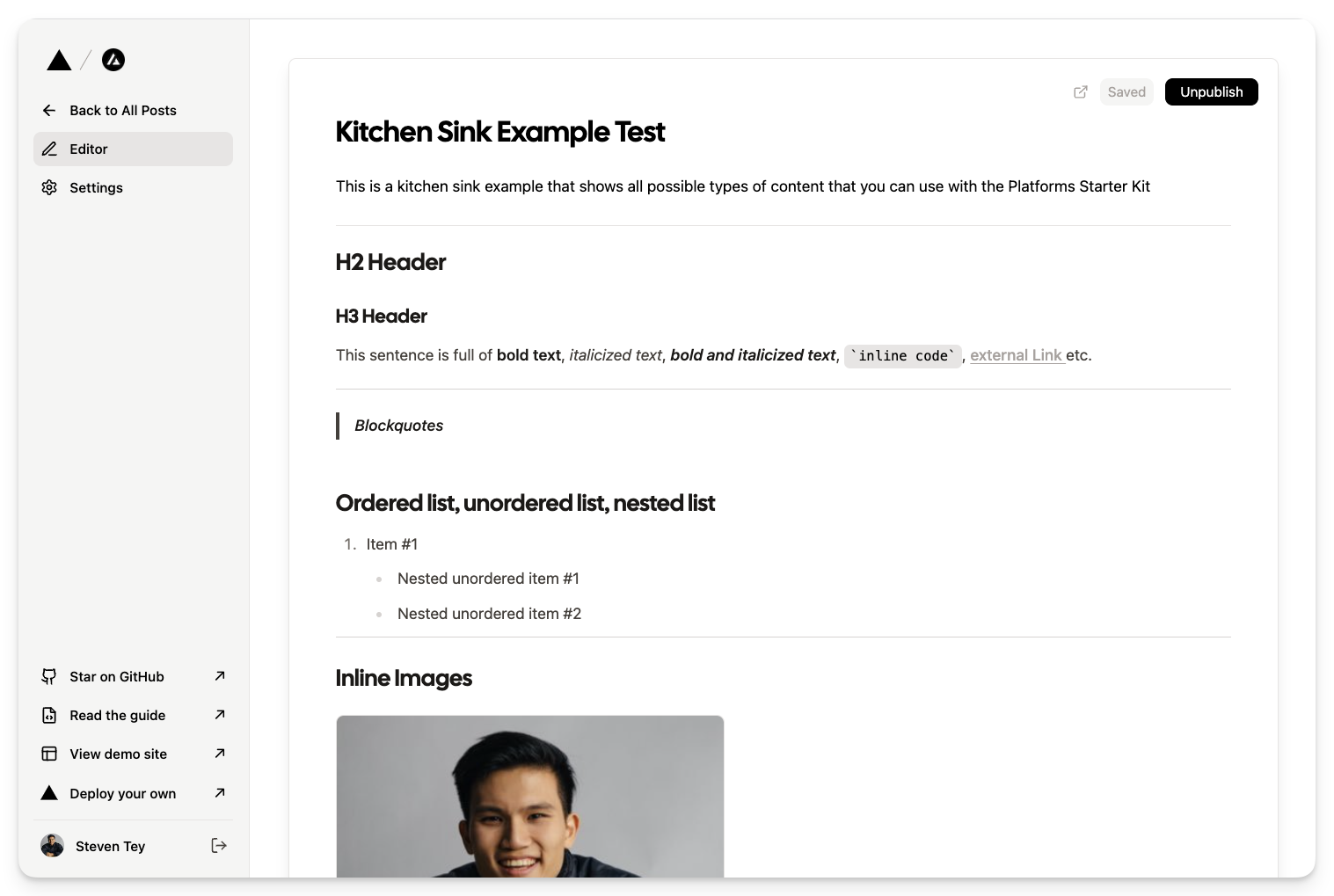
This is a Web Builder and Content Management (WBCM) platform that allows users to create their own single page websites for any kind of product promotion or e-commerce platform. It is built on top of the Platforms Starter Kit by Vercel.
Also It is used the Puck Editor for the Web Builder Editor.
- Web Builder: Users can create their own single page websites using the drag and drop editor.
- Content Management: Users can manage their website content using the Content Management System.
- Authentication: Users can sign up and login to the platform.
- Custom Domains: Users can map their own custom domains to their websites.
- Billing: Users can subscribe to a plan and pay for it using Stripe.
- SEO: Users can set SEO meta tags for their websites.
- Analytics: Users can view analytics for their websites.
- Support: Users can contact support for any issues.
- Frontend: Next.js, Tailwind CSS, Puck Editor
- Backend: Next.js API Routes, Drizzle ORM, Drizzle Kit
- Database: Turso Sqlite DB (libsql)
- Storage: Vercel Blob Storage
- Authentication: Lucia Auth
- Billing: Stripe
- Analytics: Tremor
- Deployment: Cloudfare

Deploy your own version of this starter kit with Vercel.
You can also read the guide to learn how to develop your own version of this template.
Multi-tenant applications serve multiple customers across different subdomains/custom domains with a single unified codebase.
For example, our demo is a multi-tenant application:
- Subdomain: demo.vercel.pub
- Custom domain: platformize.co (maps to demo.vercel.pub)
- Build your own: app.vercel.pub
Another example is Hashnode, a popular blogging platform. Each writer has their own unique .hashnode.dev subdomain for their blog:
Users can also map custom domains to their .hashnode.dev subdomain:
With the Platforms Starter Kit, you can offer unlimited custom domains at no extra cost to your customers as a premium feature, without having to worry about custom nameservers or configuring SSL certificates.
-
Content creation platforms
-
Website & e-commerce store builders
-
B2B2C platforms
- Md. Farhan Masud Shohag (Next.js Developer, Omnixima) Github
The MIT License. See LICENSE for more information.
"Button Group": {
fields: {
children: {
type: "text",
label: "Button Text",
},
backgroundColor: {
type: "text",
label: "Background Color (#hex)",
},
size: {
type: "select",
label: "Size",
options: [
{ value: "px-2 py-1", label: "Small" },
{ value: "px-4 py-2", label: "Medium" },
{ value: "px-6 py-3", label: "Large" },
{ value: "px-8 py-4", label: "Extra Large" },
{ value: "px-10 py-5", label: "2x Large" },
{ value: "px-12 py-6", label: "3x Large" },
],
},
textColor: {
type: "text",
label: "Text Color (#hex)",
},
borderRadius: {
type: "select",
label: "Border Radius",
options: [
{ value: "rounded-none", label: "None" },
{ value: "rounded-sm", label: "Small" },
{ value: "rounded-md", label: "Medium" },
{ value: "rounded-lg", label: "Large" },
{ value: "rounded-full", label: "Full" },
],
},
alignment: {
type: "radio",
label: "Alignment",
options: [
{ value: "left", label: "Left" },
{ value: "center", label: "Center" },
{ value: "right", label: "Right" },
],
},
},
defaultProps: {
children: "Button",
backgroundColor: "#000000",
size: "px-4 py-2",
textColor: "#ffffff",
borderRadius: "rounded-md",
alignment: "left",
},
render: ({
children,
backgroundColor,
size,
textColor,
borderRadius,
alignment,
}: {
children: string;
backgroundColor: string;
size: string;
textColor: string;
borderRadius: string;
alignment: string;
}) => {
const buttonStyle = {
backgroundColor: backgroundColor,
color: textColor,
};
const containerClassName = flex ${alignment === "center" ? "justify-center" : alignment === "right" ? "justify-end" : "justify-start"};
const buttonClassName = ${size} ${borderRadius};
    return (
      <div className={containerClassName}>
        <button className={buttonClassName} style={buttonStyle}>
          {children}
        </button>
      </div>
    );
  },
},